
Graph Transform Visualization
This page describes the graph signal transform visualization technique introduced in the communication What's in a frequency: new tools for graph Fourier Transform visualization
How can we sparsly visualize the GFT?
A Graph to Play With
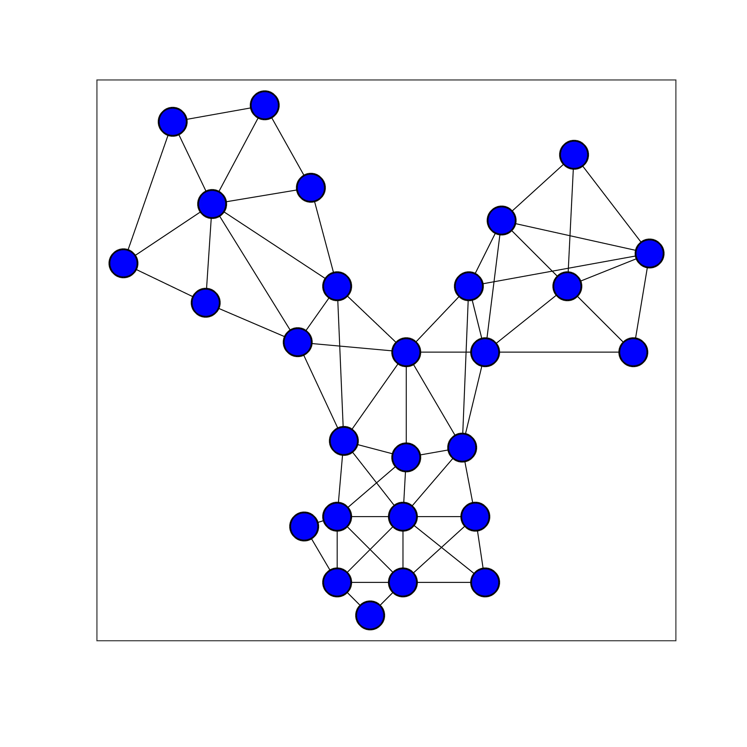
Toy graph used in this page to describe our visualization technique.
GFT Visualization: the State of the Art
Apprehending the complexity of the graph Fourier transform is not an easy task. In particular, the GFT has key differences with the classical Fourier transform for Euclidean spaces. Unfortunately, the state of the art of visualizing the GFT is very limited for a couple of reasons. First of all, as shown below, the usual way of reprensenting a graph signal is through a 2D embedding of the vertices of the graph, and representing values of the signal as colors on the vertices. Since the GFT is a essentially an orthogonal projection on a set of graph signal, representing the transform can be seen as a set of graph signals as represented below for the combinatorial Laplacian of the (unweighted) toy graph above:
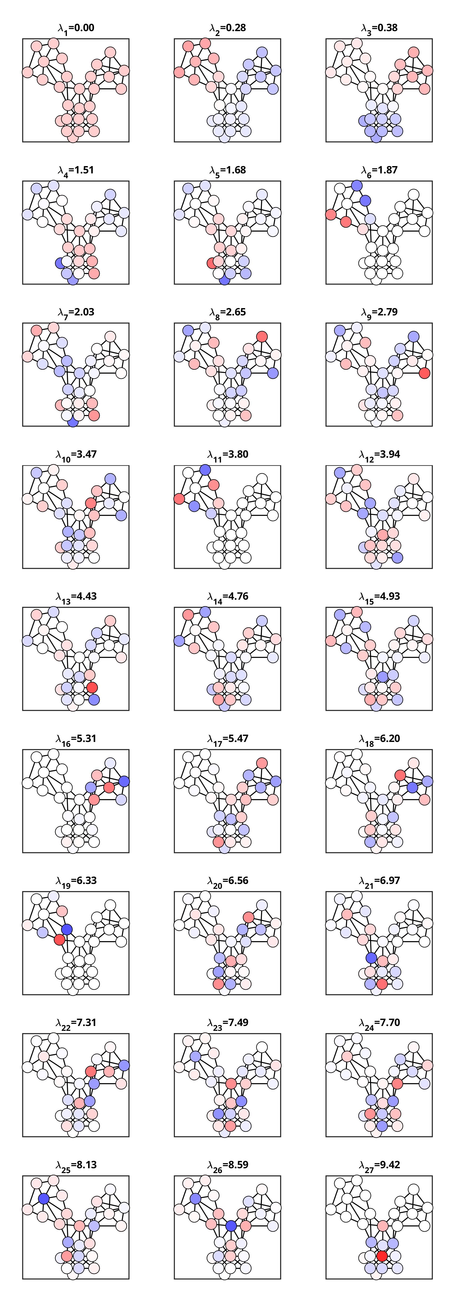
GFT modes obtained with the combinatorial Laplacian approach shown with a 2D vertex embedding.
Unfortunately, this type of visualization takes up a lot of real estate, as the scroll wheel of your mouse can attest :)
But also, this tells only half of the story. Indeed, each of the GFT modes (the signals above) is associated with a graph frequency. These frequencies are loosely shown in the figure above in the individual titles, but doing so, we cannot apprehend the frequency distribution.
Proposed Technique: the Big Picture
Our proposition is to move away from a 2D embedding, and use a 1D embedding that is more space efficient. Indeed, while some graphs may be naturally embedded in a 2D Euclidean space, many graphs are not, and choosing a 1D, a 2D, or higher dimension embedding is a somewhat arbitrary choice for those graphs. On the toy graph we use here, the 1D embedding we choose is shown below.
A 1D embedding associates a single coordinate to each vertex. This can be seen as a graph signal, and is shown as such on this figure.
This embedding is defined as the Fiedler vector of the random walk Laplacian of the graph. This is the default embedding of the function grasp_show_transform that implements our proposed visualization, but this is a free parameter to play with your favorite graph vertex embedding algorithm.
Using a 1D embedding allows then for a compact representation of the whole GFT basis.
Step 1: 1D Vertex Embedding Visualization
The visualization starts with representing the vertex 1D embedding with vertical lines, one per vertex. Each one of these bar corresponds then to a vertex, and the horizontal coordinate of the line is the 1D coordinate of the vertex.

1D Vertex Embedding Visualization
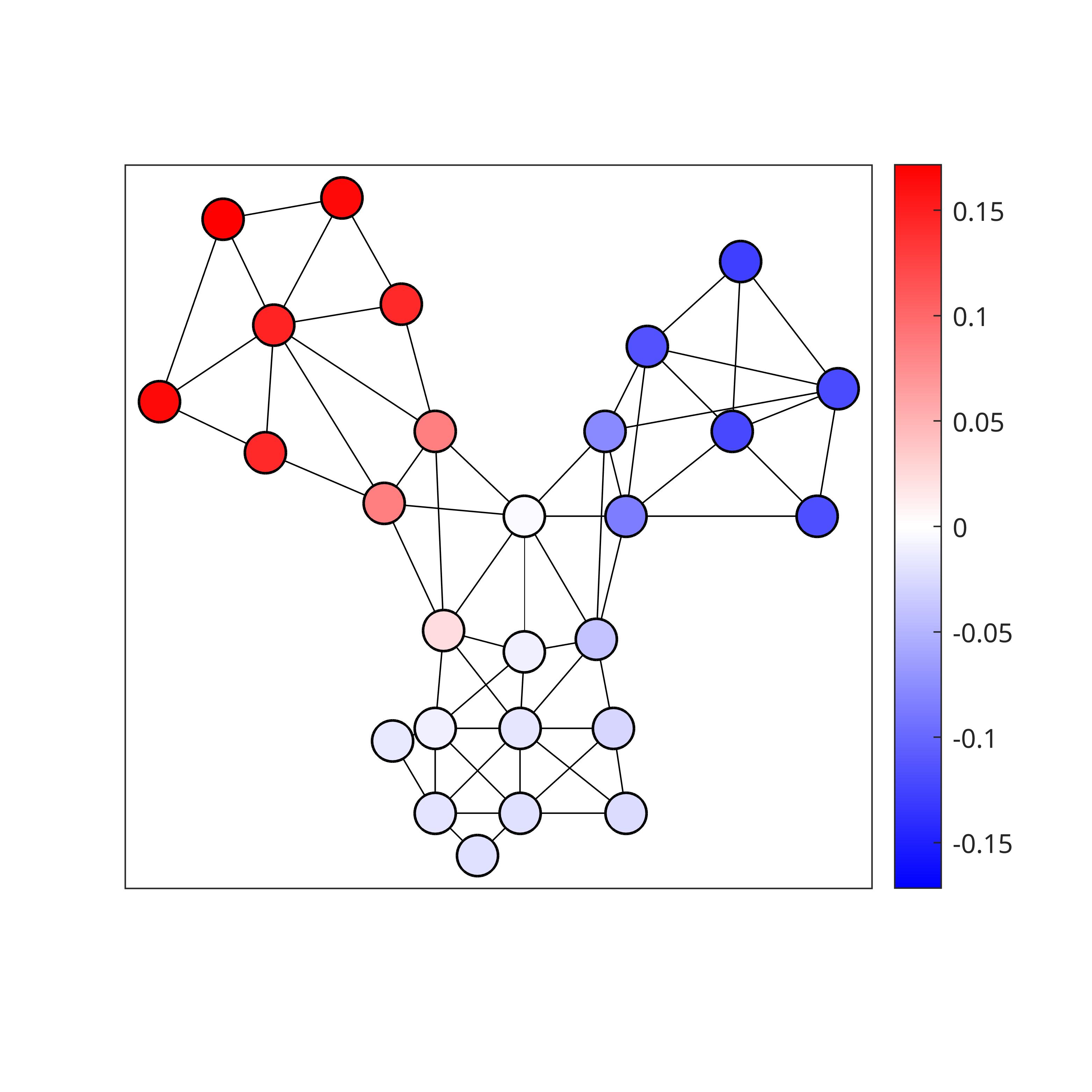
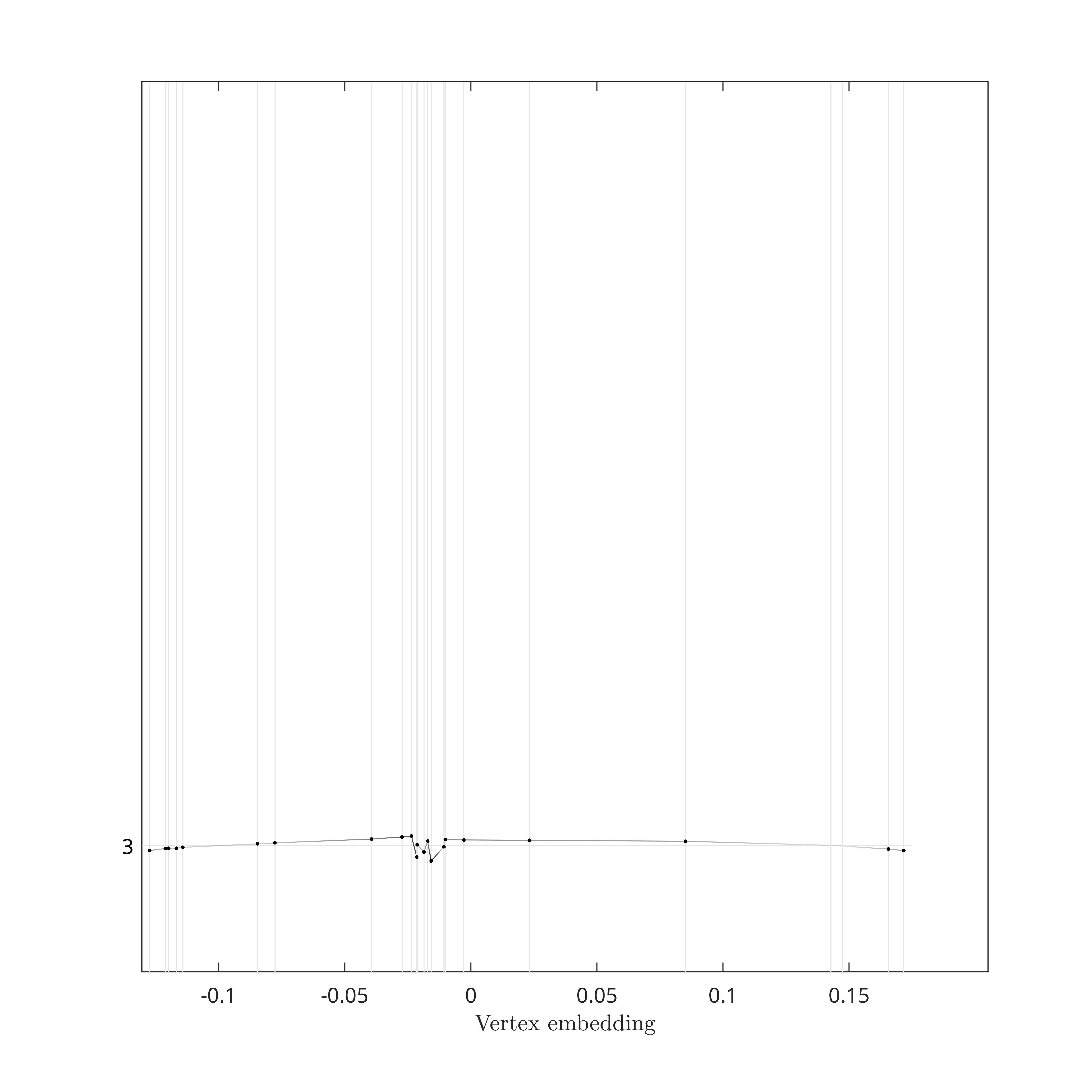
Step 2: GFT Mode Baseline
Next, we represents with a light gray horizontal line the baseline of the GFT mode. The line corresponding to the 4th GFT mode (of index 3 since indexing starts at 0) is shown on the figure below. In practice, this line would represent all GFT modes if they were all zero graph signals.

Baseline for the 4th GFT mode based on the combinatorial Laplacian.
Step 3: GFT Mode Visualization
Based on the baseline drawn above, our proposed visualization draws the GFT modes by fluctuating a pseudo time series around the baseline and according to the GFT mode. Essentially, we plot a linear inpolation of the points \(\{x_i,[u_l]_i\}\), where \(x_i\) is the coordinate of vertex \(i\) and \([u_l]_i\) is the \(i^{\text{th}}\) coordinate of the \(l^{\text{th}}\) GFT mode (this formalism assumes that the vertex indexing is ordering the vertices consistently with the chosen 1D embedding: \(x_i\leq x_{i+1}\)).
4th GFT mode based on the combinatorial Laplacian.
Step 4: Support Visualization
To better visualize and assess GFT modes localization, each time a vertex is within the support of the mode, we draw a dot for that mode and vertex. In other words, the lower the number of dots for a mode, the smaller the support, and the higher the localization.
Fourth GFT Mode Support, based on the combinatorial Laplacian, using dots.
Step 5: Stacking up GFT Modes
By shifting the baseline for each of the mode, we are then able to stack all GFT modes in a compact manner.
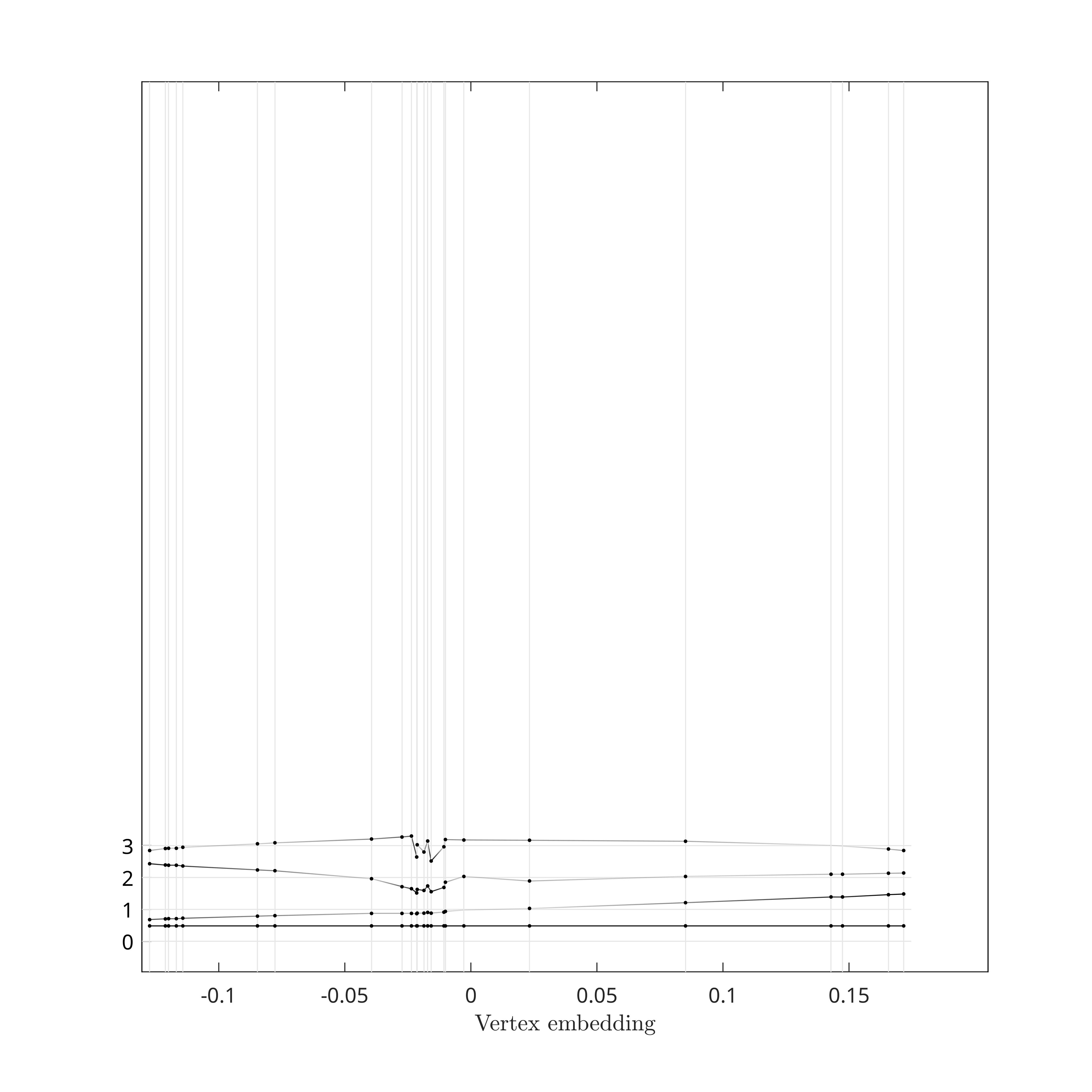
GFT Modes zero through three, based on the combinatorial Laplacian, and stacked.
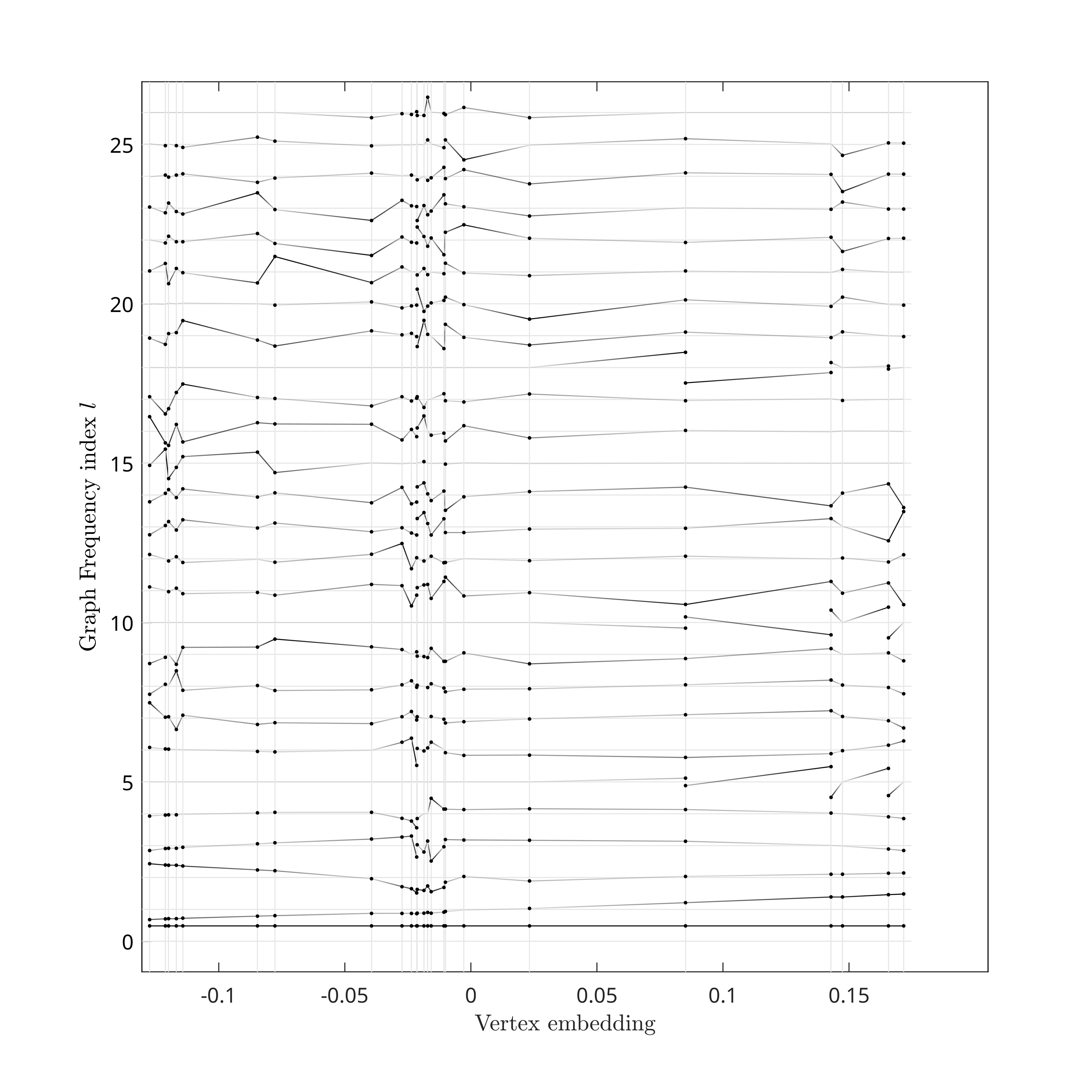
All GFT Modes, based on the combinatorial Laplacian, stacked.
Step 6: Graph Frequencies Visualization
While stacking the GFT modes in the previous step, we used a regular spacing of the baselines, essentially using the GFT mode index as baseline. However, the graph frequencies associated to the GFT modes are not regularly spaced. To better visualize this property, and how from one GFT to another the distribution of graph frequencies vary, we link each GFT mode to its graph frequency according to the right scale of the figure.
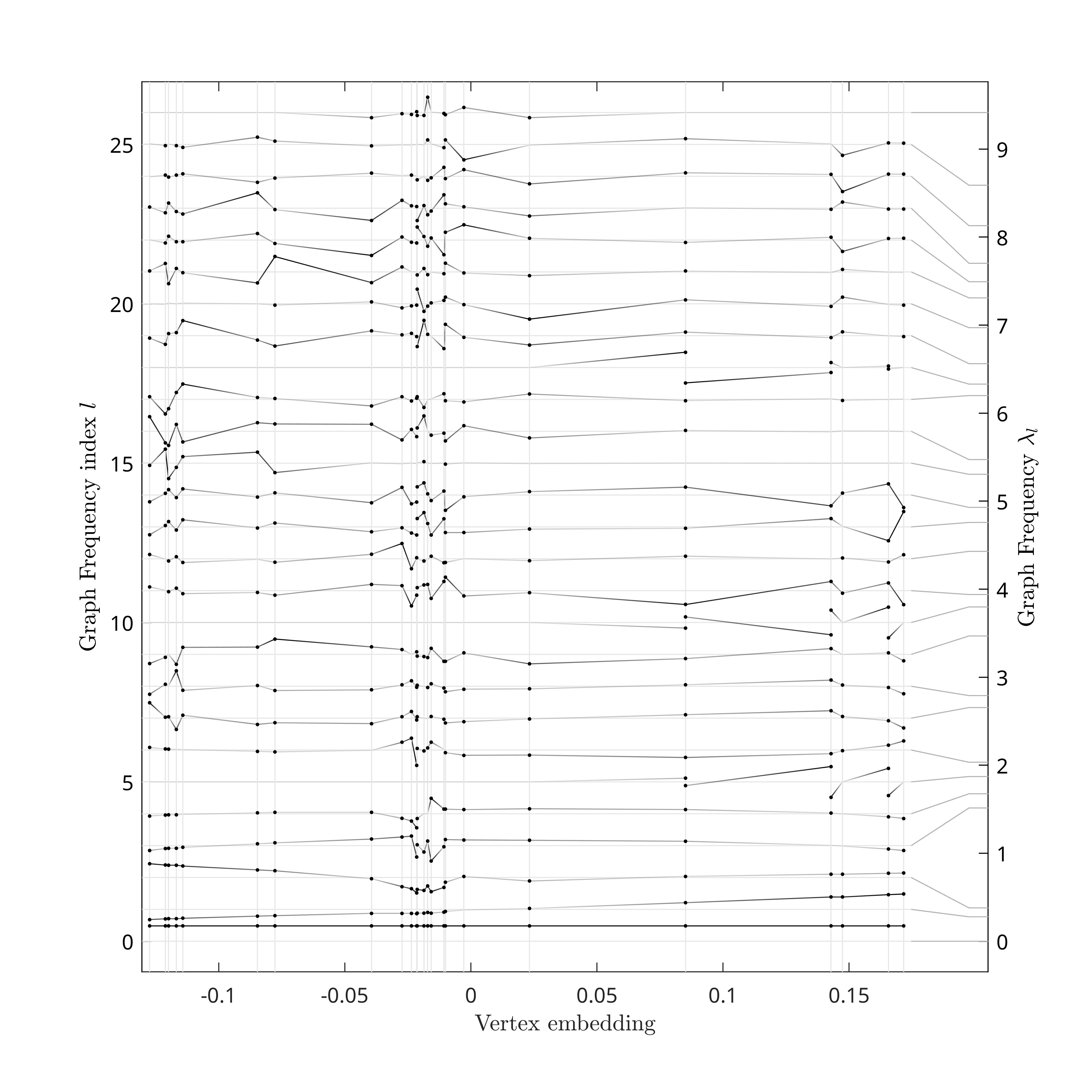
Each GFT Modes is linked to a graph frequency on the right scale.
Step 7: GFT Matrix Entries Highlighting
Although compact, our visualization technique has enough space to highlight some of the entries of the GFT matrix, i.e., specific \(\{x_i,[u_l]_i\}\). In the figure below, we use this feature to highlight entries based on a sampling strategy. In a nutshell, sampling can be thought as finding the best \(k\) vertices such that minimizes reconsruction errors for \(k\) bandlimited graph signals. Therefore, each additionnal sampled vertex corresponds then to an increase of the band by one GFT mode. The figure below shows one such sampling scheme for illustration of GFT matrix highlighting.
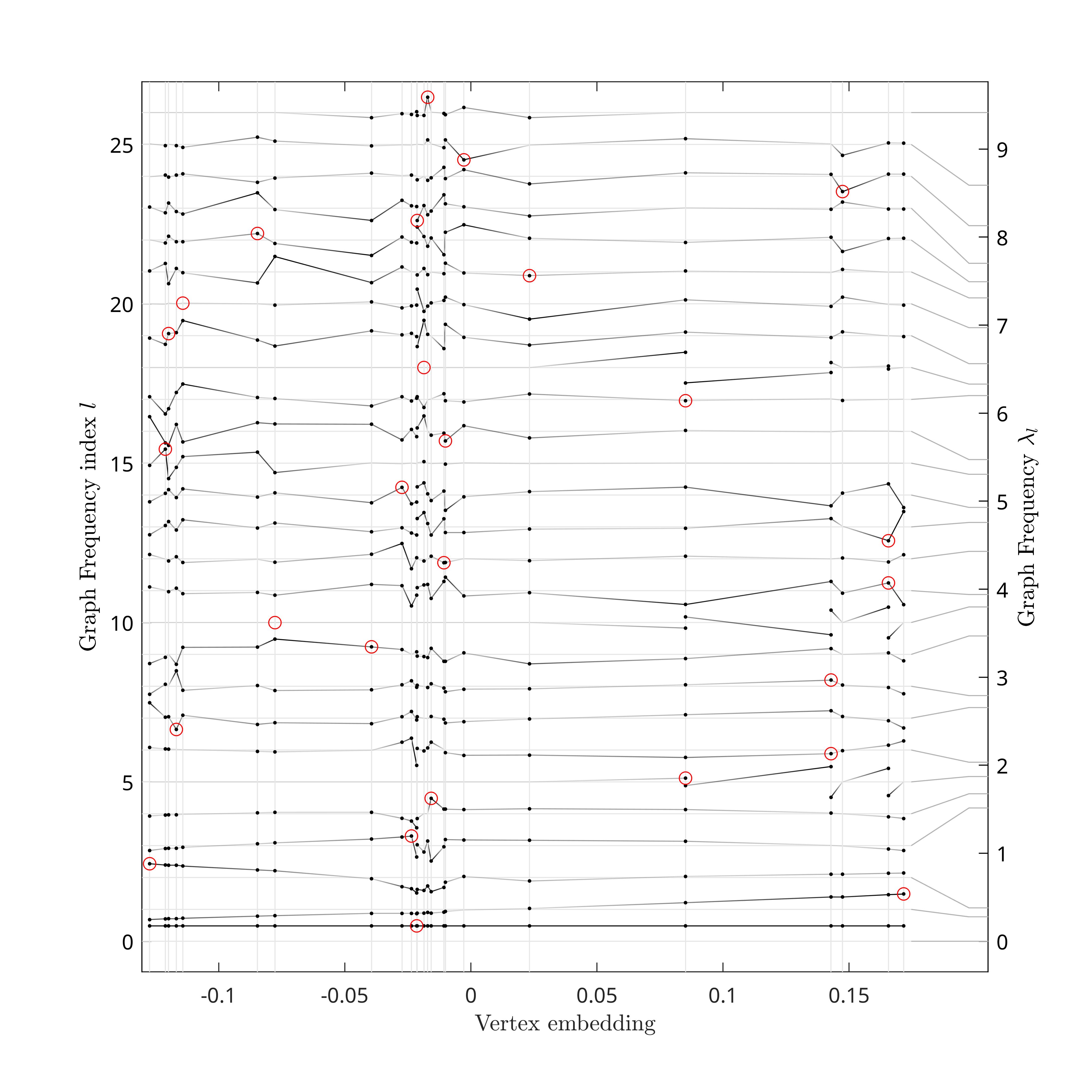
Some of the GFT matrix entries are here highlighted according to a sampling strategy.
Step 8: Graph Frequency Bands Visualization
Finally, grasp_show_transform can show several spectral bands on the GFT visualization. In the figure below, we show 8 bands of equal size that span exactly the graph spectrum \([\lambda_{\text{min}},\lambda_{\text{max}}]\).
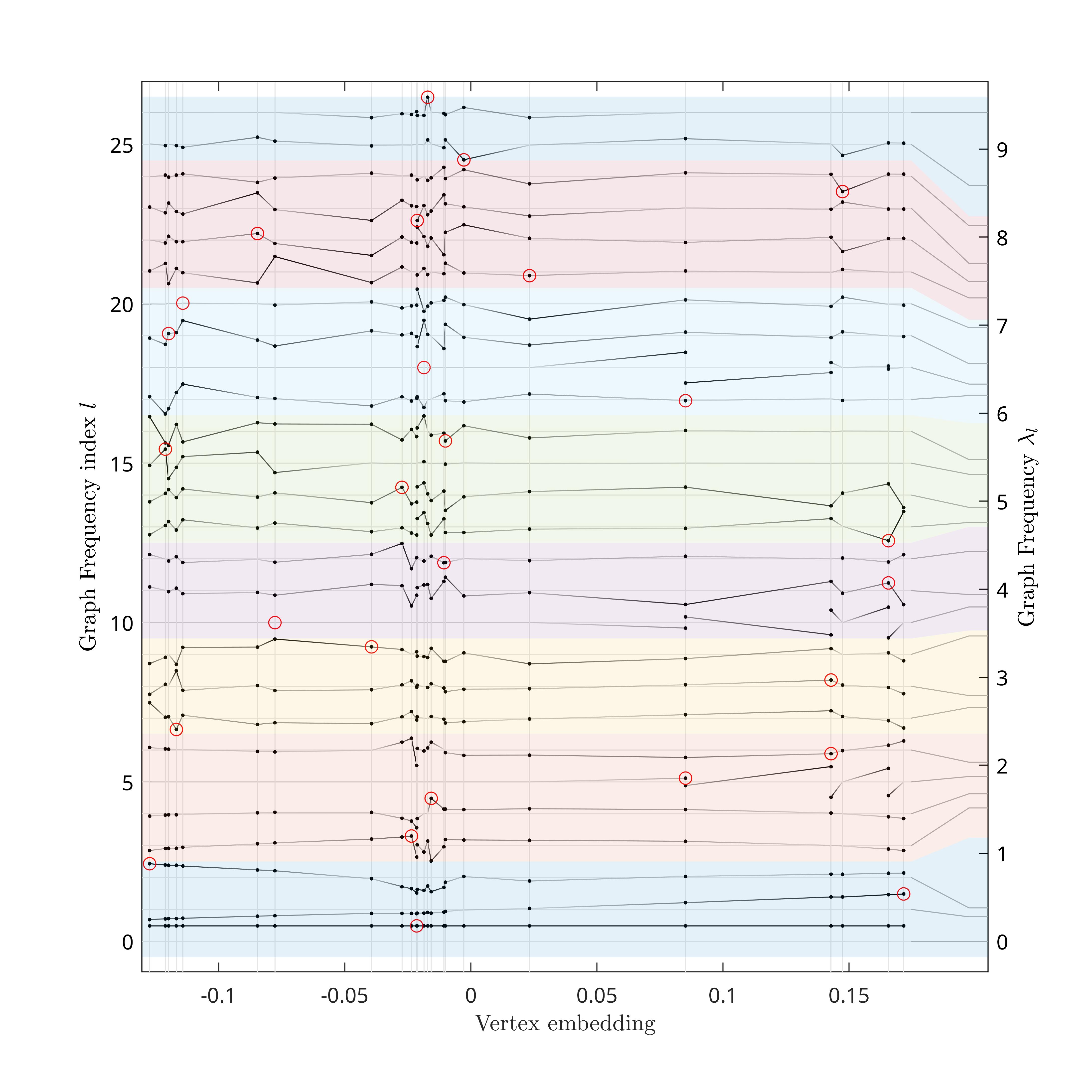
8 bands of equal spectral sizes are chosen to span the same spectral interval than the graph (right scale). Each one of the bands is linked to its corresponding GFT Modes (left). Code to generate this figure is shown below.
grasp_show_transform(gcf, g,...
                    'amplitude_scale', 1,...
                    'highlight_entries', sampling_set_highlighting,...
                    'bands', max(g.eigvals) / 8 * [(0:7)' (1:8)']);